WORK IN PROGRESS
joan l. garcia
Follow me on Instagram @joangarciaart
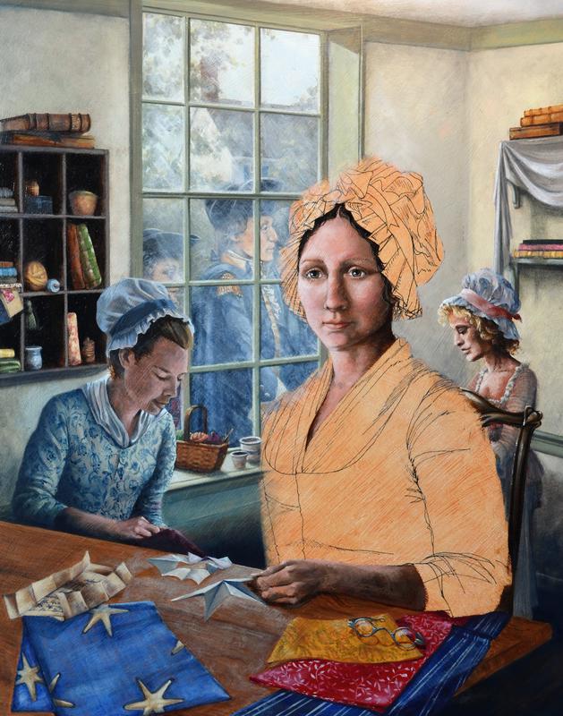
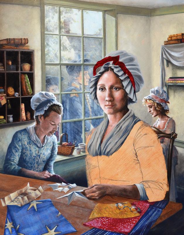
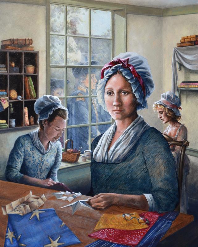
DREAMING OF LIBERTY, 16" x 20" oil on board
This is a painting of my interpretation of the moment after General George Washington, Colonel George Ross and Robert Morris spoke with Betsy Ross about designing and sewing a flag for the new united colonies. They visited her upholstery shop in Philadelphia with a suggested design that contained six pointed stars, however, Betsy suggested a five pointed star instead. She demonstrated how to cut the pattern and now holds it in her hand as she thinks of this new project and what is to come for the United States of America.


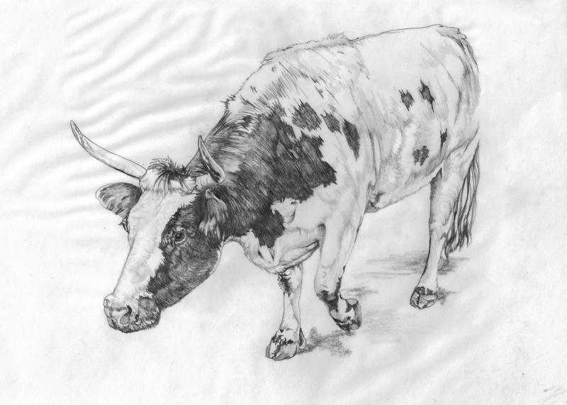

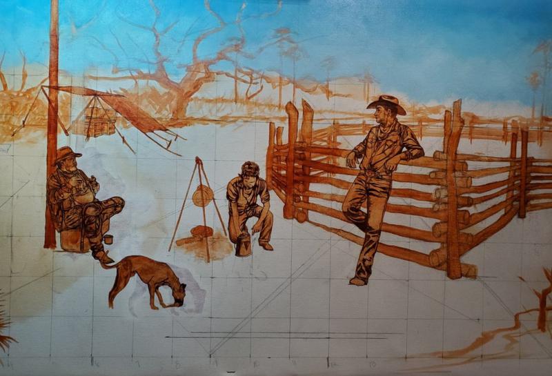
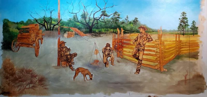
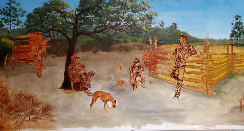
COW CAMP AFTERNOON, 36" X 18" oil on canvas
This is a painting that depicts the Florida Cowboy cracker culture an important part of Florida's agricultural history.